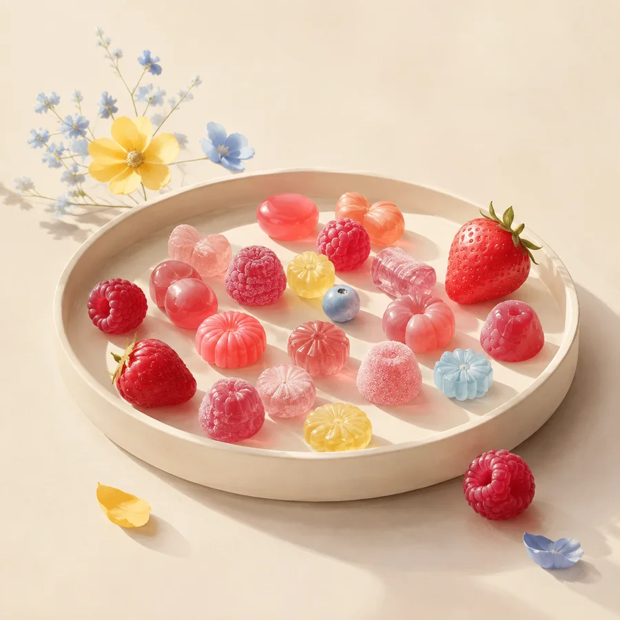
A berry or lemon in a still life can establish a color direction in seconds. It cannot prove what a nearby sweet contains. Responsible styling lets fruit guide palette and shape while captions and copy reserve ingredient claims for verified product information.
Build the berry family through value
Berry styling is more useful as a range than a single pink. Deep red can anchor the tray, raspberry pink can carry the middle values and a pale blush can open negative space. Repeating all three at different scales gives the set coherence without making every object identical.
A real strawberry or raspberry can serve as a clearly identified styling cue. Place it beside, not on top of, a generic sweet when the image should not imply that the candy contains that fruit. Caption the arrangement rather than inventing a recipe.
Let citrus sharpen the edge
Lemon yellow has high visual presence against powder blue or white. Use it in fewer, cleaner areas: one slice, one translucent sweet and a narrow highlight. When yellow appears everywhere, the eye loses the intended focal point.
Citrus peel, segment and circular slice also introduce distinct geometries. Those forms can inspire layout even in a conceptual illustration, but they should not be described as flavor compounds, juice content or nutritional evidence.
Separate theme from formulation
The FDA explains that packaged foods list ingredients and that some flavor terms can appear collectively on labels. The editorial lesson is simple: do not infer “real fruit” or a particular flavor source from color, name or package imagery. Read the current list for the exact product.
This matters for allergens as well. A coordinated dessert table may bring together items from several makers with different facilities and formulations. Preserve labels, avoid cross-contact claims you cannot support and direct guests to verified information.
Compose the transition
Berry and citrus can share a table through one bridging color. Pale coral connects pink to yellow; powder blue creates cooler contrast with both. Repeating the bridge in napkins, paper or a tray edge can be calmer than adding another confection.
Our two collection images are separate conceptual studies. They demonstrate visual themes rather than a combined tasting, commissioned event or range of purchasable products.
Working takeaway
Use fruit to organize color and form, never as substitute evidence for a sweet’s ingredients or allergen status.
Sources and scope
These references support the general factual framework. They do not endorse this journal or its illustrations.
- U.S. Food and Drug AdministrationFood Allergies
Ingredient and major-allergen labelling context for packaged foods in the United States.
- U.S. Food and Drug AdministrationTypes of Food Ingredients
How ingredient lists and certain color or flavor terms appear on labels.