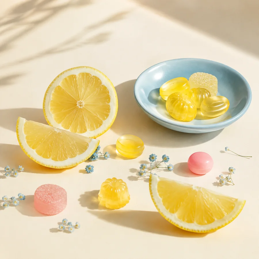
Pastel does not have to mean low contrast everywhere. A successful sweet table uses a quiet field, a limited family of soft colors and at least one darker or more saturated note that restores hierarchy.
Begin with the neutral field
Choose the table covering, tray and background before matching sweets. Warm cream makes pinks feel softer and keeps lemon yellow from looking greenish. A cooler white can sharpen blue but may make an otherwise gentle set feel clinical.
Photograph or preview the empty setup under the intended light. If the neutral already contains strong color casts or reflections, every later match becomes harder to judge.
Assign roles, not equal shares
Give one pastel the background role, one the supporting role and one the accent role. A blush field, powder-blue vessel and small yellow highlight will read more clearly than equal areas of all three. The exact ratio is a design choice, not a universal recipe.
Repeat the accent sparingly at different heights. One yellow sweet near the front and a smaller echo at the back can guide the eye across the arrangement without forming a rigid pattern.
Protect text and wayfinding
If labels or place cards are part of a real event, use dark graphite text on a light solid surface rather than placing thin lettering over patterned candy. Decorative color should not reduce legibility.
The same principle applies online. Pastel card backgrounds require dark body text and visible focus states; pale pink text on cream is not an accessible substitute for a color accent.
Test the camera translation
Screens and cameras compress subtle differences. Make a phone snapshot under the actual light, then check whether adjacent pale colors remain distinct. Adjust the background or value before increasing saturation across the entire scene.
Keep color correction honest. A conceptual image can be expressive, but product photography should not materially change the appearance of an item being represented for purchase. Candy & Color does not sell the illustrated objects.
Working takeaway
Build pastel hierarchy on a deliberate neutral, assign color roles and preserve enough value contrast for both objects and text.